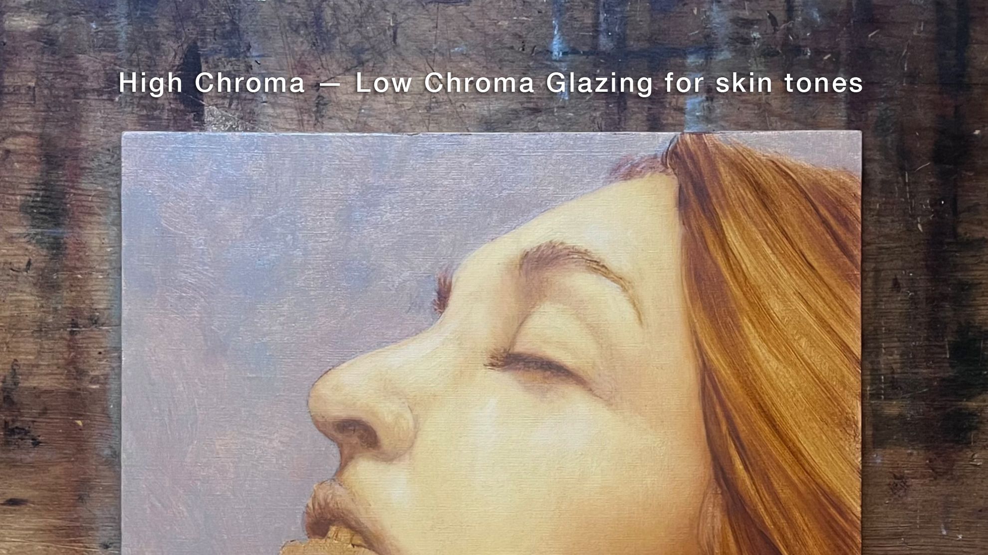
High chroma - low chroma glazing for skin tones
Jun 29, 2023I think the generally accepted approach to glazing — applying thin layers over an underpainting — is like trying to build a birdhouse with a sledge hammer. Especially when using a limited palette, because dichroic effects happen. Often.
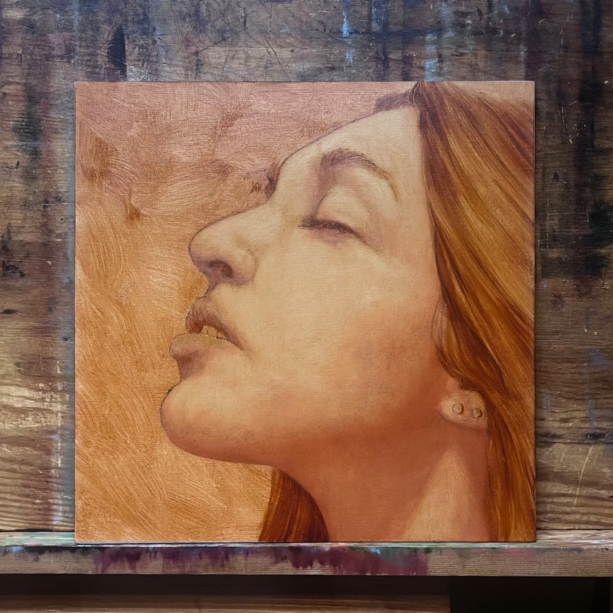
 First Color Stage: 7.5YR at 8th Chroma
 Second Color Stage: 2.5YR at 8th Chroma
 Third Color Stage: 7.5YR at 8th Chroma
 Fourth Color Stage: 10YR at 2nd Chroma
I see it all the time. Painters glazing with primary colors over some sort of underpainting. It seems like a good idea but unexpected results happen all too often and there's no easy fix. I'm on a strange trip to find a better way. Those of you who know me already know the answer starts with Munsell.
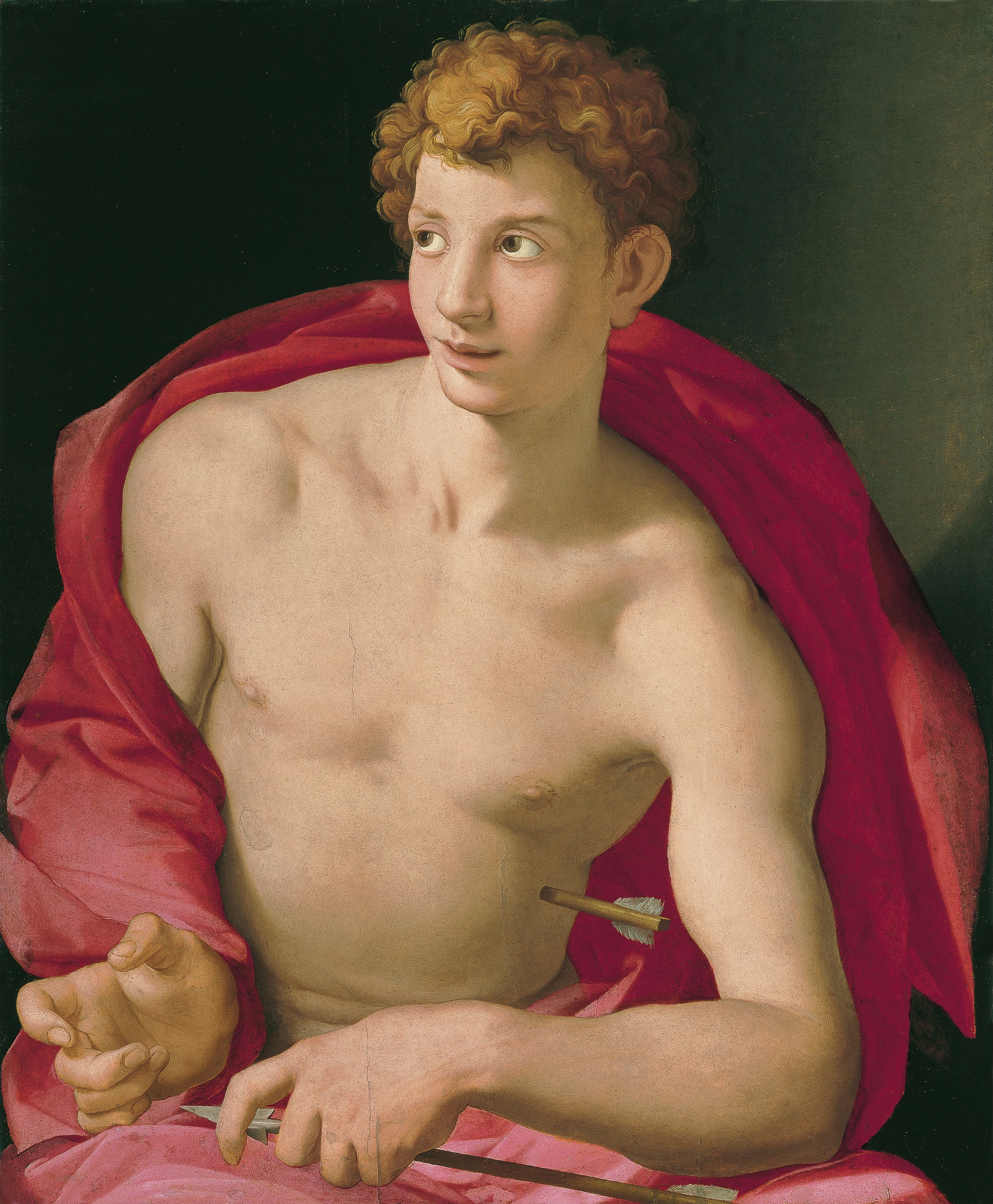
First, a look at cringey results from an amazing painter, Agnolo Bronzino.

Not terrible. Edges, shadow hues and reflected light could all be improved. And what happened to the shadow cast be the arrow?
Now, a study pointing to a better approach, the 1636 study for van Dyck's portrait of Nicholas Rockox.

Can you see the warm underpainting showing through the low chroma second layer?
Here's another van Dyck, really sophisticated color.
 Portrait Study of a Bearded Man Anthony van Dyck
Look closely at the hue in the grays. It's near identical to those used in the Rockox study. Then look at the way the face is modeled. I love the brushstrokes.
More to come...
Here's another Bronzino. Some of the forms and transitions are sublime. Others not so much.

This is a blatant attempt to get you to sign up.
And if you do, I promise not to be too boring or pedantic. So if you want, fill in the form below.
I hate SPAM, so I won't never ever sell your information, for any reason.

